
In a world increasingly dominated by digital communication, you might assume that traditional business cards have lost their relevance. However, business cards remain a vital tool in professional networking, bridging the gap between physical and digital communication. The psychology behind effective business card designs is a fascinating exploration of how subtle elements like color, typography, layout, and texture can leave a lasting impression. Business cards are more than just contact information—they are reflections of identity, professionalism, and brand values.
This article delves deep into the psychological aspects that make business cards effective. By understanding how the human mind perceives and responds to visual stimuli, you can create business cards that not only capture attention but also foster meaningful connections.
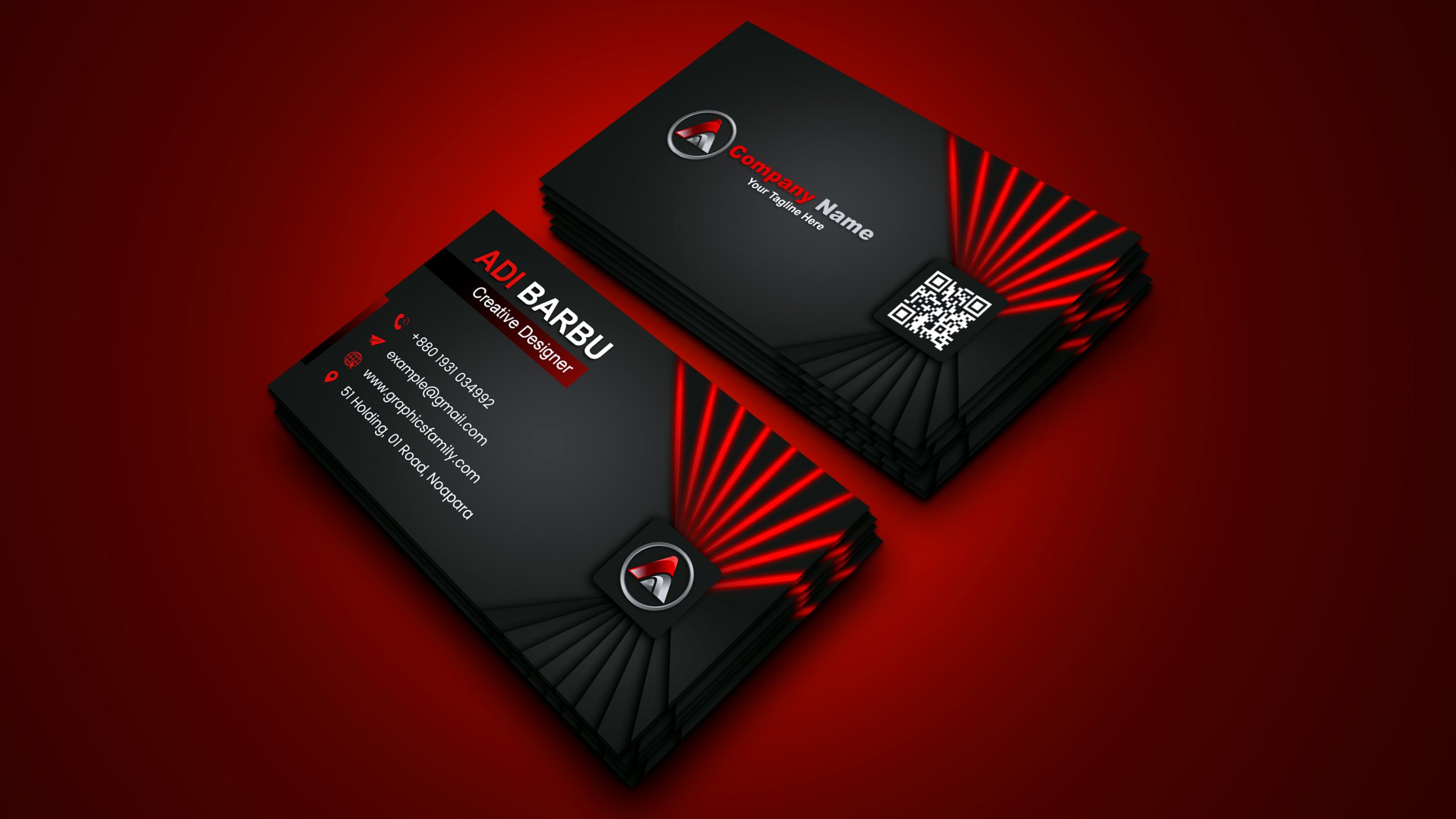
Why Business Cards Still Matter
Before we dive into the psychological aspects, it’s important to understand why business cards still play a pivotal role in professional interactions. While technology offers convenient alternatives like email and social media, business cards provide a tangible, personal touch that digital means simply cannot replicate.
First Impressions Last
Psychologically, the first impression sets the stage for future interactions. When you hand someone a business card, it is often their first tactile interaction with your brand. This makes the design and presentation of business cards crucial in establishing credibility and trustworthiness. A poorly designed business card can create doubt, whereas an aesthetically pleasing and professional card can instantly enhance your image.
Tactile Memory and Engagement
Business cards engage multiple senses, particularly touch. Research shows that people are more likely to remember something they have physically interacted with compared to something viewed on a screen. The weight of the paper, the texture, and even the finishes on business cards contribute to how they are perceived and remembered. High-quality business cards with unique textures or materials engage tactile memory, making them more likely to stand out in a pile of cards.
Building Personal Connections
Exchanging business cards is an age-old ritual that fosters a personal connection between two individuals. It’s an exchange that requires face-to-face interaction, reinforcing a sense of trust and professionalism. The act of handing over a business card is intimate, creating a moment of focus between two parties, which can leave a more lasting impression than an email or text exchange.
The Psychology of Color in Business Cards
Color plays a significant role in how business cards are perceived, as colors evoke specific emotions and associations. The psychology behind color choice in business cards is essential to creating the right impression.
Trust and Professionalism
Blue is often associated with trust, reliability, and professionalism. This is why many corporate entities and financial institutions use blue in their branding. If your goal is to project trustworthiness, consider using shades of blue in your business cards. However, be mindful of the hue, as dark blues can convey stability while light blues evoke calmness and approachability.
Passion and Energy
Red is an attention-grabbing color often linked to passion, excitement, and energy. If your business operates in a high-energy industry, such as marketing, entertainment, or fashion, incorporating red into your business cards can signal boldness and innovation. However, too much red can come off as aggressive, so balance it with neutral tones.
Sophistication and Luxury
Black exudes sophistication, elegance, and exclusivity. Business cards with a black background, especially when combined with gold or silver accents, give off a luxurious vibe. This can be especially effective for industries such as law, consulting, or luxury goods. However, using black requires careful design choices to ensure the card remains legible and approachable.
Growth and Sustainability
Green is associated with growth, nature, and sustainability. Businesses in industries like health, wellness, or environmental services can benefit from using green in their business cards. It projects an image of balance, harmony, and responsibility. Lighter shades of green tend to be more calming, while darker greens convey stability and prosperity.
Optimism and Creativity
Yellow is the color of optimism, creativity, and warmth. It catches attention and can stimulate mental processes. However, yellow can be overwhelming if used excessively. Adding subtle accents of yellow can brighten up your business cards, making them appear more inviting and creative, especially for creative industries like design or advertising.
The Subtle Art of Communication

The typography on business cards is more than just a font—it’s a communication tool. The style, size, and spacing of your text can influence how your business is perceived.
Tradition and Authority
Serif fonts, which have small lines or embellishments at the ends of letters, convey a sense of tradition, authority, and formality. They are ideal for industries that rely on trust and long-established reputations, such as law firms or financial institutions. Serif fonts create a sense of gravitas and reliability, making them an excellent choice for professional business cards.
Modern and Minimalist
Sans-serif fonts, which lack the embellishments of serif fonts, are modern, clean, and minimalist. They are often used by tech companies, startups, and brands looking to convey simplicity and forward-thinking values. Sans-serif fonts are easier to read in smaller sizes, which makes them practical for business cards that may include a lot of information.
elegance and creativity
Script fonts are cursive, often resembling handwritten text. They exude elegance, creativity, and a personal touch, but should be used sparingly. If you’re in a creative or artistic field, a script font for your name or logo can add a touch of personality to your business cards. However, ensure the font is legible and not overly ornate.
Font Size and Hierarchy
The size and arrangement of text on business cards can guide the reader’s eye, making the most important information stand out. Typically, your name or company name should be the largest element, followed by your title and contact information. A well-organized hierarchy prevents the card from looking cluttered and makes it easier for recipients to find essential information quickly.
The impact of layout and spacing
Effective use of layout and spacing is crucial in business card design. A well-balanced card is visually appealing and easy to read, while a cluttered card can be overwhelming.
White Space
White space, or negative space, refers to the blank areas around the elements on a business card. Psychologically, white space is important because it gives the eyes a place to rest and creates a sense of clarity and professionalism. Overcrowded business cards can feel chaotic and unorganized. By incorporating white space, you create a cleaner, more refined look that makes it easier for recipients to absorb the information.
Balance and Symmetry
Humans naturally gravitate toward balance and symmetry. A well-balanced layout, where elements like text, logos, and images are distributed evenly, creates harmony. Symmetry on business cards suggests professionalism and organization, while asymmetry can evoke a more modern and creative feel.
Texture and Material
The physical attributes of business cards—such as their texture and material—play a significant role in how they are perceived. Psychologically, the texture can convey a sense of quality, professionalism, and thoughtfulness.
Matte vs. glossy finishes
Matte finishes tend to feel smooth and understated, while glossy finishes are more reflective and vibrant. Matte finishes give business cards a sophisticated, professional feel, whereas glossy finishes can make colors pop and add an element of vibrancy.
Embossing and Debossing
Embossing (raising elements off the card) and debossing (pressing elements into the card) create a tactile experience. These techniques add a sense of dimension and luxury, making your business cards feel more premium. Embossed logos or text can stand out not just visually but also through touch, leaving a lasting impression.
Paper Stock and Thickness
The thickness and quality of the paper stock used for business cards can have a significant psychological impact. Thicker, high-quality paper stock feels more durable and substantial, which can reflect the stability and reliability of your business. Flimsy business cards may unconsciously signal a lack of professionalism or attention to detail.
Conclusion
Business cards are more than just practical tools for sharing contact information—they are powerful representations of your brand and identity. By understanding the psychology behind design elements such as color, typography, layout, and texture, you can create business cards that resonate with your target audience and leave a lasting impression.